
Code Snippet for making your Squarespace Website Responsive

Okay first of all, what does responsive even mean? Making your website responsive basically means to make it adaptable for viewing on other devices. These days there are basically a bajillion different devices on which your website could potentially be viewed.
Even if you think your site looks killer on your laptop, it might look like a jumbled mess on an iPhone, which might make your business seem unprofessional or may lead to visitors leaving your site prematurely.
Think about how often you use your smartphone to look things up. Now that it is possible, people want their content and information on the go. People aren’t going to be like I want to see so and so’s website, I’ll have to wait until I get on my computer at home to look at it. It’s 2020! Everyone has a smartphone and the point of a smart phone is to use the internet on the go!
Additionally, If you are relying on social media to increase your traffic and you have included your link there, you can expect that a lot of your views will come from a mobile device, especially instagram. If you plan to use Instagram as your main marketing tool, with direct access to your website, a responsive site is very important since Instagram was made to be used on a smart phone.
If you are curious about the actual statistics on which device your website is viewed, check out the Squarespace analytics tool to see exactly how many views have come from which type of devices. My data says that 54 percent of views are mobile. You can even see visits by browser information which will also tell you if your link was clicked on in the facebook or Instagram app. Cool stuff and very helpful when it comes to marketing!
Okay so now you are like But…I thought square space makes your site responsive automatically. It does to some extent. It really depends on how customized the website it. Chances are, if you are sticking to a template, it will probably already look pretty good on mobile. But if your site has a high level of customization, you will want to double check what it looks like on a mobile device if you haven’t already.
My site looks absolutely nothing like the original Squarespace template, so after I was done designing I definitely had some issues. A big issue was the header, which is important since that is the first thing people see.
HOW TO FIX THE PROBLEMS
So let’s get into how to fix these problems. It’s really just one little snippet of code you need to address certain areas that look funky on your mobile site. Before adding the code snippet this is what my website looked on desktop vs mobile.
Desktop
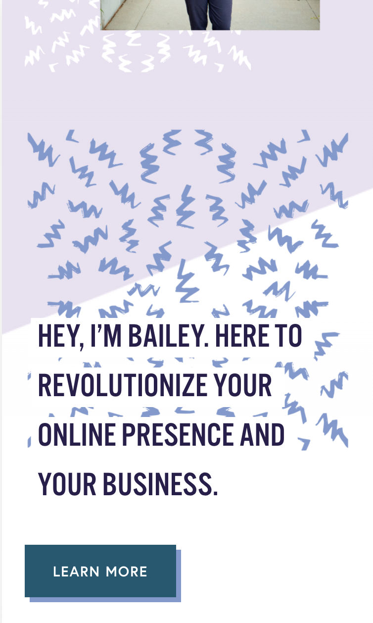
Mobile
I have the design just how I like it on the desktop version (for now 😛) but I don’t like the layout on the mobile version. My headline is an overlap image block with the pattern and on the mobile version, it just looks weird because the pattern element is way bigger than it should be for its relevance. Its size makes it seem like a really important element but it’s really not that important its just a fun little design element. The headline is the most important element.
For the mobile version, I’m just going to get rid of the pattern and just use the text. Also, I think that that the ‘learn more’ button would look better in the center. So to customize the mobile version of my site I will have to enter some code!
If you find coding intimidating, don’t worry you can do this! I will provide a snippet that will make the CSS customization much easier.
Before you enter the code, you will want to find where to do that. under the Main Squarespace > Design > Custom CSS

Also before I add any code, I have to create another headline element that I will use in the mobile version. To do that, I'm just going to add a simple text box above the image block that currently contains my headline. For the mobile version, I am just going to stick with the text. Notice I also centered the text Since a headline is going to take up the entire width of the mobile screen, I personally think it will look better if it's centered.

Now what the coding is going to do is hide one of the headings on the desktop versions and hide the other heading on the mobile version. One more important step before we get to adding the code. To address each heading in the code, you will have to find the section id of each element. There is a browser extension you can add called Squarespace ID finder.
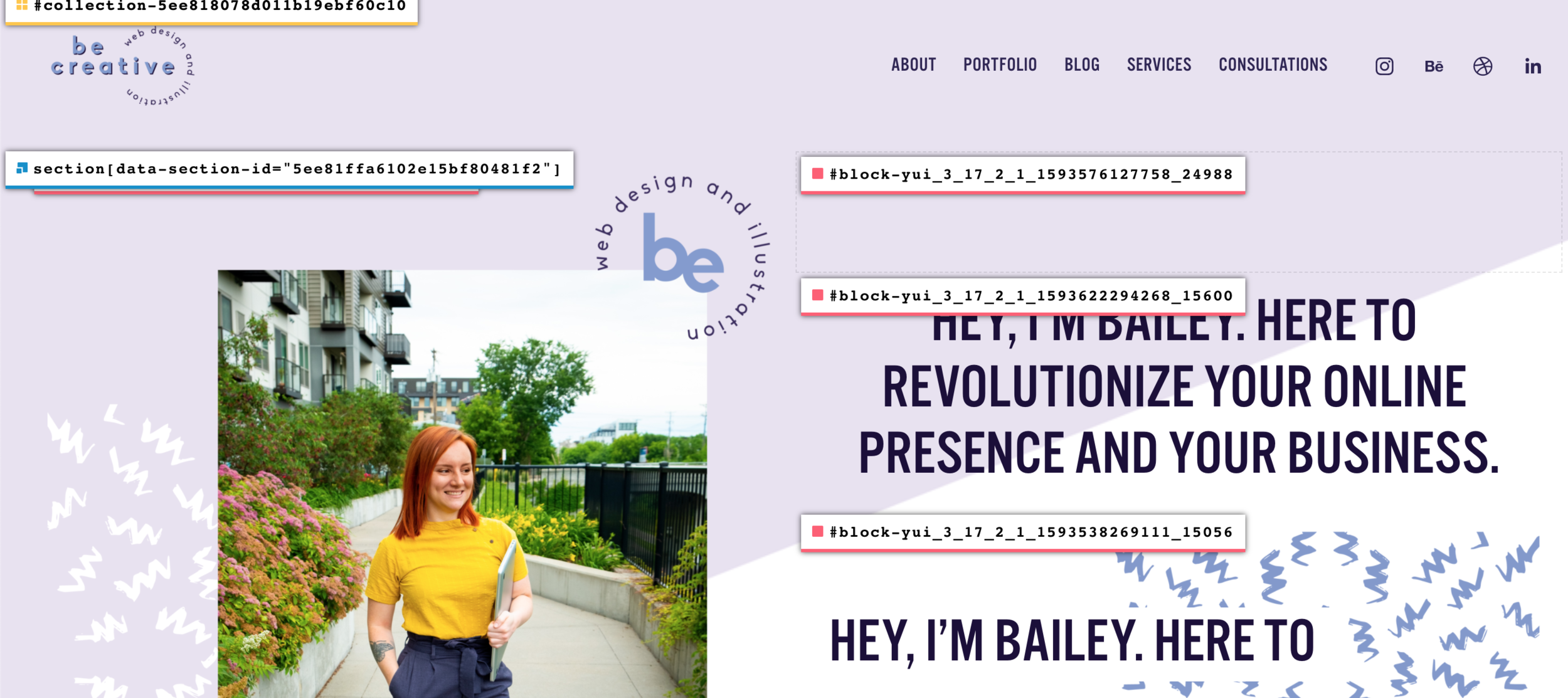
Okay now for the fun part! Here is the code snippet you can copy and paste to designate one element to the desktop version and one to the mobile version. All you have to do is erase the block IDs and replace them with the IDs of the elements you are working with.
#block-yui_3_17_2_1_1593622294268_15600 {display: none;}
@media only screen and (max-width: 768px) {#block-yui_3_17_2_1_1593622294268_15600
  { display: flex; justify-content: center; }
}
@media only screen and (max-width: 768px) {
#block-yui_3_17_2_1_1593538269111_15056
  {display: none;}
}
I would also like to center the button under my heading to match the centered text. Here is the code snippet for that.
@media only screen and (max-width: 768px) {
#block-yui_3_17_2_1_1592326769861_14860
  { display: flex; justify-content: center; }
}
Here's the difference between the two versions after adding the code! You can see the new version is much cleaner and easier to read for a smaller screen. I also like how now you can see the image of me, the header, and the ‘learn more’ more button all in one view without scrolling. The desktop version of your site is where you can add those extra fun design elements but for the mobile version, it might be a good idea to keep it a little more minimal and straight forward.

Old
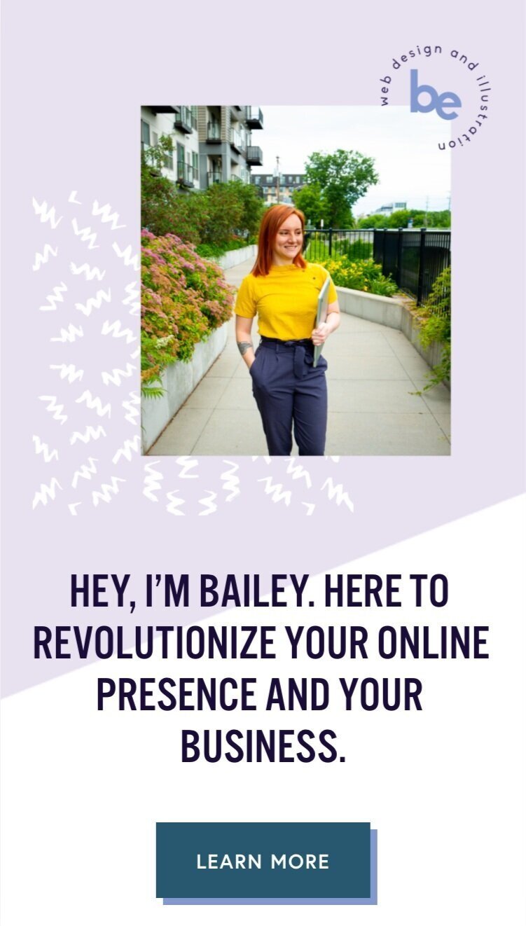
New
Thanks for hanging in there with me! I think this is one of the most useful code snippets you can implement on your site. If you are neglecting the mobile version of your site, now is time to take action. Go through your mobile version and make a list of things you see that could be taken out or might look better centered.


