How to Choose Your Brand Colors

There are so many decisions to make when building your brand. From logos, to fonts, to brand photos, patterns, and more ahhhhh! It can be so overwhelming.
I would recommend trying to focus on tackling each aspect of your brand one by one.
In this post, I will provide some guidance on how to nail down your color palette. One of the hardest things to decide for your brand is definitely narrowing down a color palette. It can be hard to choose because once you choose a color palette it is something that your should really stick to so you can create a consistent identity and brand awareness.
There are so many things to consider when choosing a color palette that will accurately represent your brand. Colors are actually very powerful when it comes to evoking emotion. Colors, believe it or not also have a deeper meaning. On top of that, there are zillions of colors.
Choosing a color palette for your brand shouldn’t really be about what colors you like but what colors are representative of your brand and will attract your ideal audience. For example, if you love pinks and purples and bright colors but you want your brand to attract high-end, luxury clients, you are going to want to take that into consideration by curating a clean, neutral color palette.
Luckily, I can help lead you in a color palette direction that will accurately represent your brand and your brand’s personality! This post will provide valuable info about different types of color palettes and how the meaning will come across and what type of clients it will attract.
Neutrals

Neutrals are definitely trending right now. You may be scrolling through social media and noticing a lot of neutral color palettes happening, which will naturally make you feel like you should also have a natural color palette for your brand. While it can be good to follow trends, in this case you truly have to think if a neutral color palette actually represents your brand or if you feel like you need to use a neutral color palette because everyone else is. When it comes to branding, it really is important o create an identity that stands out so I would encourage you to really think about choosing a color palette that is unique to your brand and personality.
With that being said, neutrals are great for brands that want to come across as luxury or high-end. Having a neutral color palette feels clean, sleek, minimalist, and modern. Neutrals are great for luxury jewelry brands, clothing brands, accessories, interior design, + architecture brands that sell high ticket services and products and want to attract an audience that is looking to spend a pretty penny on your offers.
Warm Colors
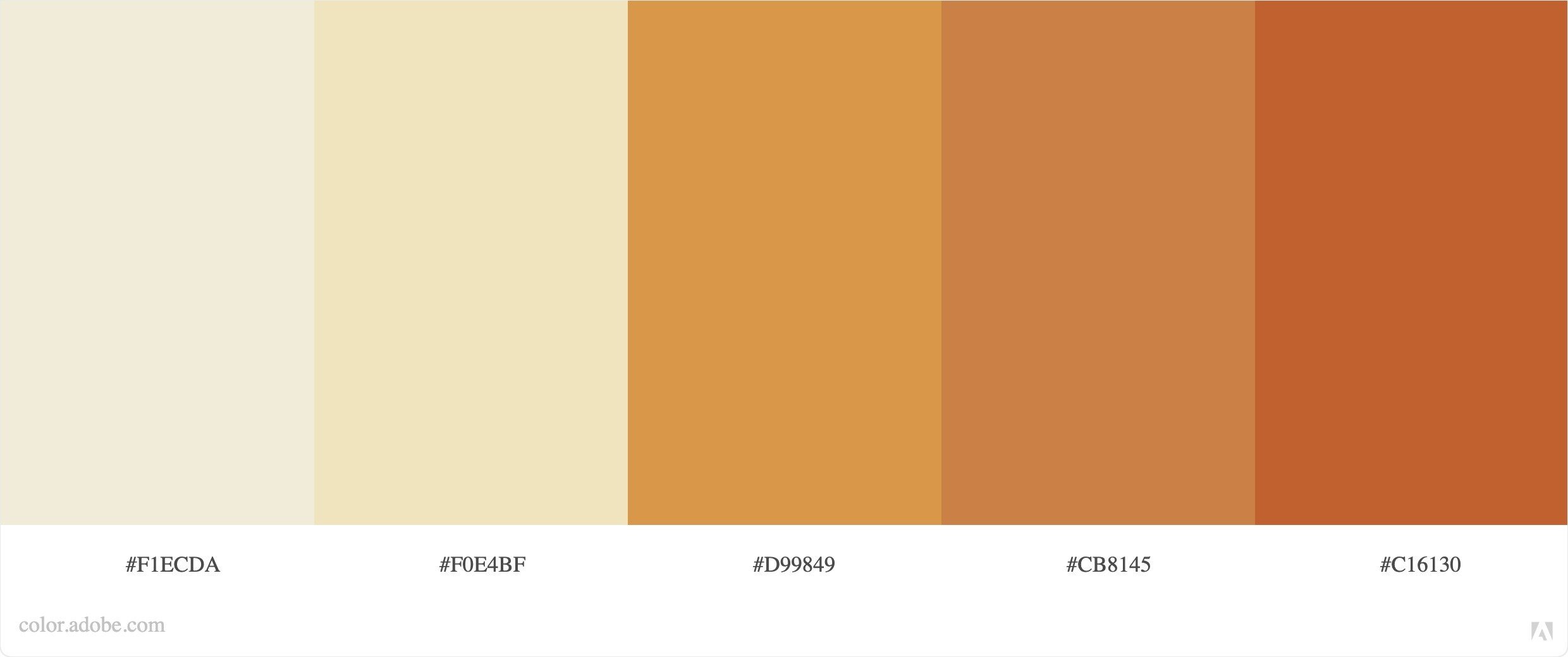
If you like the natural vibe but want to add a little more personality, consider using a warm color palette that still has a bit of life to it. This color palette is still neutral but it feels more accessible and inviting. Warm color palettes provoke happiness and warmth.
A warm color palette is a good direction to go in for photographers, clothing brands, make-up brands, pottery brands, & home decor. This color palette will attract that humble, friendly audience that lives for sweater weather and having a hot cup of tea by the fire.
Bold + Colorful

If you want a color palette that will undoubtedly turn heads, curate a bold and bright color palette ideally using complimentary colors. This type of color palette will attract a bold personality. It is free spirited and adventurous. It is show stopping. This type of color palette is for those that have a product or service that is maybe a little experimental and doesn’t give a f*&# about what anyone thinks. These bright colors also feel young and modern so keep that in mind when thinking about what client you want to attract.
This color palette is perfect for any type of creative with colorful, bold work. Funky jewelry brands, painters, food photographers, graphic designers. If you have a bold product or service, having a bold color palette, it is essential to attract the type of audience that loves things that are outside of the box and a little out there.
Cool Pastels
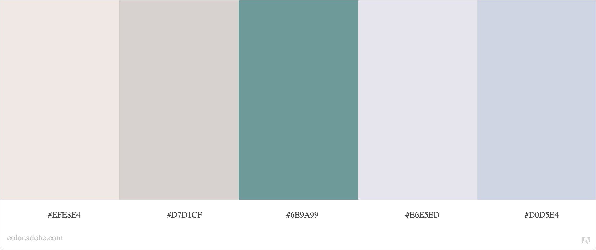
Cool colors including blues, purples, greens + pastels make us feel dreamy and happy. They also give off a sense of purity in some contexts. Pastel colors evoke a calm and refreshing feeling. Pastels are often associated with spring and the idea of rebirth and renewal.
This type of color palette is perfect for wedding planners, wedding florists, + baby brands. It will attract an audience that is going through a transformation in their life such as a wedding or pregnancy. This color palate also attracts the dreamers that always have something positive to say and have a smile on their face.
Earthy
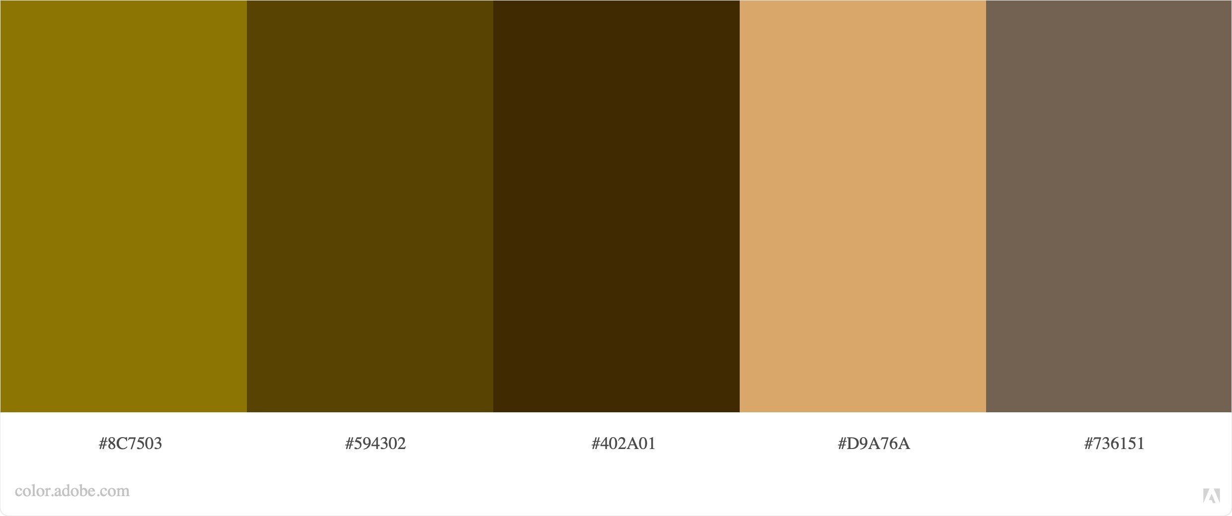
The earthy color palette evokes our connection with the natural world. It makes us feel strong, comforted, + reassured. Earth tones make us think of adventure and nature so this type of color palette is great for attracting the outdoorsy type.
This type of color palette will attract a more gender-neutral audience. It is perfect for outdoor brands such as hiking apparel, camping gear, nurseries, landscaping, architecture, and sustainable brands. This color palette represents the type of person that loves to spend their free time hiking, rock climbing, and feel a strong connection with our earth.
If you loved these branding tips but can’t quite imagine how to make all these decisions for your brand without professional help, I got you. I can create a brand for your business that is beyond your wildest imagination that is guaranteed to hit the sweet spot with your ideal audience. Pop on over to my services page to see how I can help!