
how to reorder content for Mobile view Using Custom CSS
It is the era of trendsetting web design and unfortunately, some of those trends aren’t so mobile-friendly.
Layering, split layouts, parallax, asymmetry, and zig-zag layouts are a few of the current trends that create dynamic, attention-grabbing websites and truly take web design to the next level. However, you may find yourself disappointed when you see your gorgeous website in mobile view.
Along with advances in web design, there have also been advances in technology meaning many new devices with different screen sizes that your site could potentially be viewed on. So if you want your website to look dynamic on a desktop, you need to also learn how to make it responsive. You can’t ignore it!
One mobile optimization topic that has people stumped is how to reorder content or blocks when the order doesn’t quite make sense in the mobile view. This often happens if you have created a zig-zag layout or asymmetrical layout.
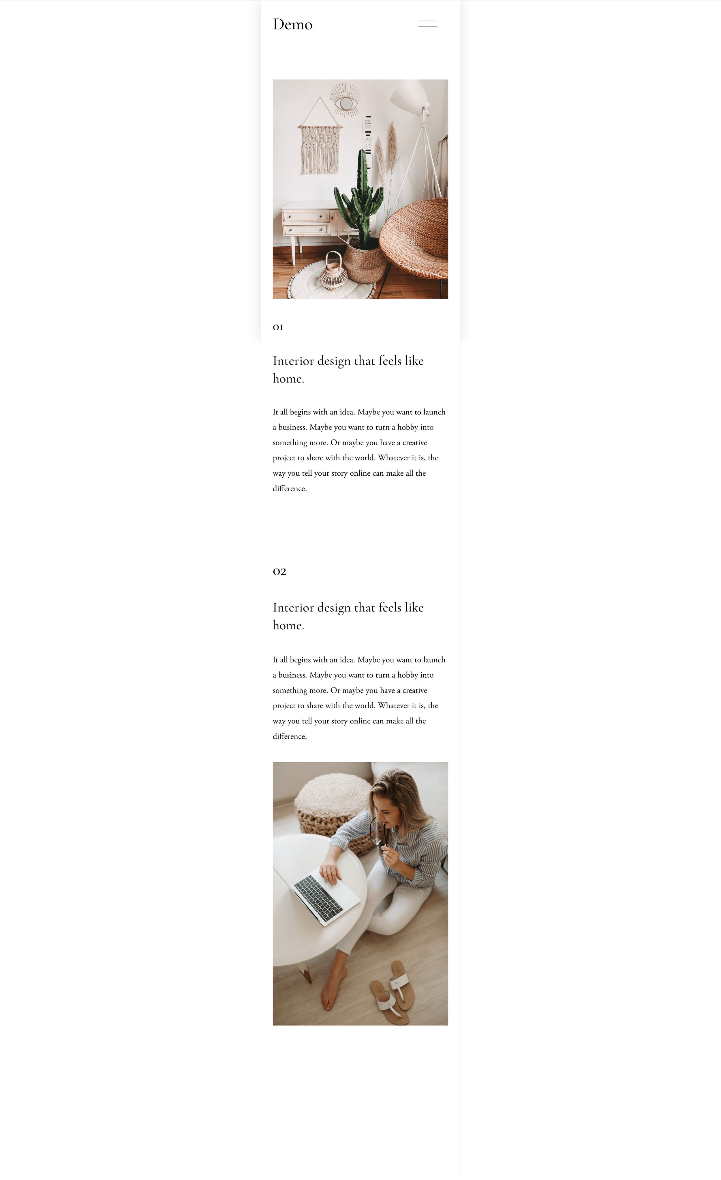
The reason that the order of objects goes wacko on your mobile version is that responsiveness works in columns. When your site gets squeezed down onto that little tiny phone screen, it will take the second column of content and push it under the first column. Here is an example -

Look at this gorgeous zig-zag layout! But once you look at the mobile view, the images and text don’t order every other like you would want them to.

There are various ways to fix this but some of them can be quite complicated. Luckily I have an easy fix to reorder elements using CSS.
For this tutorial, you’ll want to open the custom CSS window. You will find it under the design tab in the home menu.
You will also want to know view the mobile version within the Squarespace editor. In Squarespace 7.0 go to the very top of the editor and you will see a line. when you hover over it it will transform into a down arrow. Click on it and you will be able to switch between different device views.


In Squarespace 7.1 you will also find the mobile view button at the top of the editor on the right-hand side.

Copy and paste the code below into your Custom CSS window.
@media screen and (max-width: 767px){
section-id{
.sqs-row{
display: flex !important;
flex-direction: column-reverse !important;
}
}}
the @media only screen and (max-width: 767px) { } code tells the CSS only to apply to the webpage when it is in mobile view, which is roughly 768px. Note: any code you add, for the mobile view, be sure to add it inside the brackets.
Now, you want to replace the section-id with the actual section id of the section you want to adjust. Since this code is going to reverse content in the entire section, it’s important that you create a separate section for the content you want to reverse. In order to find your section id, use the Chrome extension, Squarespace ID Finder.

When you turn it on, your Squarespace editor will look like this. Click on the section to copy it.

Then, replace your section id into the code in your CSS window. Your code should look something like you see in the screenshot below. Once you have customized the code for your individual elements, you should have a gorgeous mobile view.

Before -
After

CODE:
@media screen and (max-width: 767px){
section-id{
.sqs-row{
display: flex !important;
flex-direction: column-reverse !important;
}
}}
You can apply this code to any elements you would like to swap around so you can get your device versions to look exactly how you want! If you want to dive deeper into mobile-optimization using CSS, check out my other mobile optimization post
If the overwhelm is setting in and If you are thinking that even with these tips you’ll never be able to pull it off, I get it. It can be overwhelming and it’s okay! That’s what web designers are for. Feel free to check out my services page to see how I might be able to help you while you are kicking a** at building and running your business!


